

Discussion of current velocity
Figures 5-26a through 5-26k plot current velocity at selected nodes across the
DYNLET channel. Each figure displays calculated velocity at selected nodes
and the calculated offshore velocity (Node 1), as well as a calculated velocity at a
selected preceding node exhibiting a significant change in velocity. The plots
contain comparisons for spring tide, 5-8 October 2002. The areas under velocity
curves above and below may not be equal because these curves represent velocity
at one station (one point) at a particular node. The current velocity at other
stations may have different and compensating behavior. In contrast, total
discharge at cross sections (all stations summed) as given in Figures 5-25a to
5-25c must show the same amount of water entering on flood as exiting on ebb
for any tidal cycle (assuming no freshwater inputs to the pond).
The model calculations clearly demonstrate a relationship between limiting
depths at Goldsmith Inlet and maximum velocity through it. Control by limiting
depth is evident at Node 8 during times of flood current and at Nodes 8 and 21
during times of ebb current. Maximum calculated current velocity within the
channel at Goldsmith Inlet increases by an order of magnitude between nodes as
the flow enters the inlet mouth between Nodes 6 and 7, owing to the constriction
and decrease in depth. At Node 7, the inlet mouth, the flow is still predominantly
sinusoidal, but with a shift toward flood dominance. With distance into the inlet,
similar to findings for calculated water level, the signal for the current velocity
becomes more flood dominant.
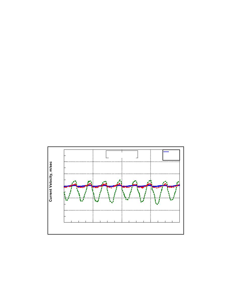
1.8
Node 1
Goldsmith Inlet
------- Node 6
------- Node 7
1.2
0.6
0.0
-0.6
-1.2
-1.8
10/6
10/7
10/8
10/5
10/9
5 - 8 October 2002
Figure 5-26a. Current velocity calculations offshore of Goldsmith Pond and
DYNLET Nodes 6 and 7 calculations, 5-8 October 2002
255
Chapter 5 Circulation Analysis

 Previous Page
